How people use colour is quite personal and if one person said the colour red to 20 people, those 20 people would view the colour red in different tones or hues. This means that colour is subjective and is undoubtedly affected by our own likes and dislikes as well as location, light levels and use of the garden.
Colours can appear in different ways to us for example, red is classed as a ‘hot colour’ and it really does demand your attention and has the effect of coming towards you. Yellow also comes towards you but isn’t as demanding as red, yellow tends to reflect available light. Green is ‘cool’, it makes a good backdrop to other colours and blue is a very cool colour that often seems to merge with the background and looks smaller to its red counterpart.
Garden Colour Tips
Hot colours – red, orange and yellows; these are strong, warm, attention seeking, stimulating and lively and can make your space feel smaller and more intimate. Most plants that fit this description will come from the sunnier climates like South Africa and the tropics. These colours can become quite difficult to see during the evening or in lower light levels.
Cool colours – pale blues, creams and pinks in the spring become a little stronger as the season moves on and are indigenous of northern Europe. Blues, pale violets and greens show up best in lower light levels i.e. shady planting schemes and offer a calm, subdued and restful effect, these colours tend to recede and can therefore make a small garden feel larger.
Harmonious colours are those nearest each other on the colour wheel for example, blue, violets and green from the cooler more restful side and red, yellow and oranges from the warmer more dramatic side.
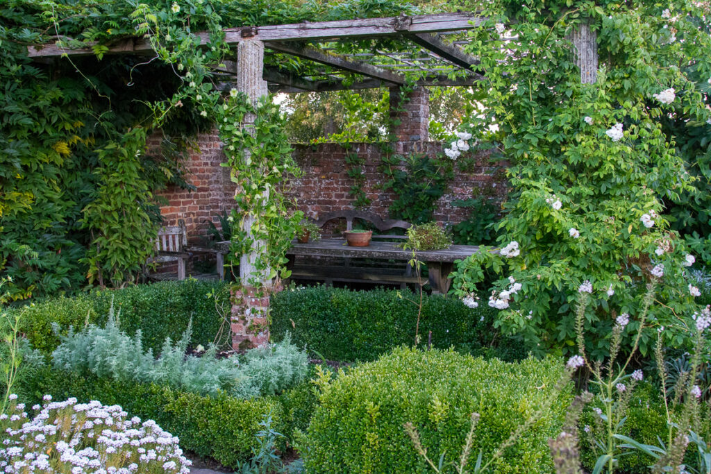
Monochromatic colour schemes are those that are usually one colour but where plants are selected by using their tints, tones and shades of that hue. You may have heard of a famous monochromatic planting scheme, The White Garden at Sissinghurst in Kent. Different tones, tints and shades of white have been used and are offset by the use of silver and greys and then backdrops of greens. Our image shows part of the White Garden at Sissinghurst photographed in September.
Contrasting colour schemes are from the opposite sides of the colour wheel for example red with green, blue with orange and yellow with violet. These are also known as complementary colours and by having two next to each other it forces the eye to see the other colour more intensely.
Care must be taken when using white in the garden because white flowers stand out from other colours and can disrupt a colour scheme as your eye is immediately drawn to it. There are few true white flowers; most of them have touches of pink, blue, green or yellow in them and can therefore be used with plants of the appropriate colour. This colour is excellent for shady difficult areas to lighten and bring life to it.
If you are a person who wants lots of colour in their garden it can be the most difficult scheme to achieve purely because colour is transient and frequently changes with the seasons. If you recognise yourself here, remember that form and texture also play a really important part.
There are so many possibilities for our gardens. It is important though once you have chosen your colour scheme be strict and only plant those colours you have decided on. This will ensure that your planting holds together, creates the mood you want and doesn’t feel busy or disjointed.


